

Types of Charts in Excel: Many teams with excellent raw data fail to explain anything meaningful because the wrong visual was chosen and while moving into 2026 Types of Charts in Excel have progressed into a core skill. This guide is written to reflect that reality. ocusing on how Types of Charts in Excel actually work in real situations.
Most professionals do not struggle with formulas as much as they struggle with presentation. That is where Types of Charts in Excel step in. The moment raw data turns into visuals, patterns appear, key insights surface, and conversations change. According to internal Microsoft training material and several Excel MVP interviews published around 2024, most reporting mistakes are visual, not numerical. Understanding Types of Charts in Excel fixes a surprising number of those problems.
Why Types of Charts in Excel Still Matter in 2026
The assumption that dashboards or BI tools have replaced Excel is not fully accurate. In many organizations, especially small and mid-sized ones, Excel remains the final stop for decision-making. Types of Charts in Excel help translate data points into something decision makers can grasp quickly.
What this really means is that the correct chart types in excel allow readers to see trends instead of numbers, relationships instead of confusion, and comparisons instead of clutter. When different chart types in Excel are used correctly, even complex Excel data visualization becomes accessible to non-technical audiences.
Another point that often gets overlooked is trust. When visuals match the nature of the range of data, stakeholders trust the report more. This is why learning Types of Charts in Excel is less about memorizing menus and more about understanding intent.
Column and Bar Charts Explained

Column and bar charts are usually the first stop when learning Types of Charts in Excel. These visuals are ideal for comparing data points across categories. Sales by region, attendance by month, or expenses by department all fit naturally here.
Column charts are vertical and tend to work better when time or order matters. Bar charts are horizontal and are useful when labels are long. Among all chart types in excel, these are often the most misused simply because they look easy. When raw data has too many categories, readability suffers.
In professional reports, column charts are frequently used to extract key insights quickly. When chosen from different chart types in excel, they should represent discrete values clearly, not trends over time.
Line Charts and Trend Analysis
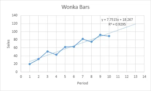
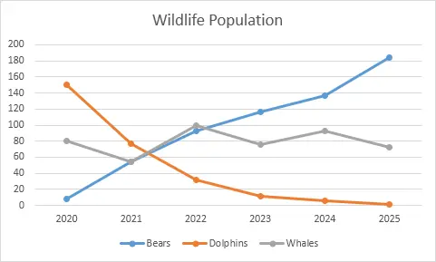
Line charts exist for one primary reason, to show movement. Among Types of Charts in Excel, line charts are best suited for time-based data. Monthly revenue, yearly growth, or website traffic trends all belong here.
What often happens is that people force line charts onto categorical data. This weakens excel data visualization and creates misleading interpretations. Line charts assume continuity. When used correctly, they highlight key insights that are invisible in tables of data points.
According to reporting guidelines shared by Optimize Smart, line charts outperform other chart types in excel when the goal is to show direction rather than comparison. The range of data should be continuous and evenly spaced for best results.
Pie and Doughnut Charts in Context
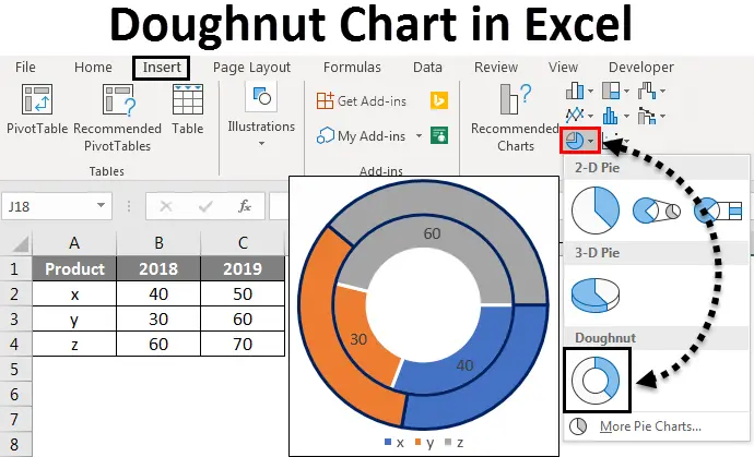
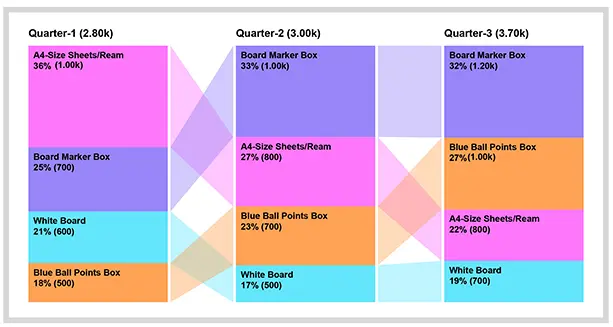
Pie charts are controversial, yet they remain part of Types of Charts in Excel for a reason. They work when showing proportions within a whole, but only when the number of segments is limited.
Doughnut charts function similarly but allow for a cleaner center space. Both chart types in excel are often overused, especially with complex raw data. When more than five categories are present, key insights get lost.
Experienced analysts recommend using pie visuals only when the story is simple. Among different chart types in excel, these are the most sensitive to misuse. When applied correctly, they communicate distribution faster than any table.
Area Charts for Volume Comparison
Area charts are essentially line charts with filled space. Within Types of Charts in Excel, they are useful for comparing cumulative values over time. For example, tracking multiple product lines contributing to total revenue.
The problem arises when overlapping areas hide data points. In excel data visualization, clarity should always come first. Area charts require thoughtful ordering and transparency adjustments.
When chosen from chart types in excel, area charts work best with limited series and a consistent range of data. They emphasize volume rather than precise values, which is an important distinction.
Scatter and Bubble Charts for Relationships
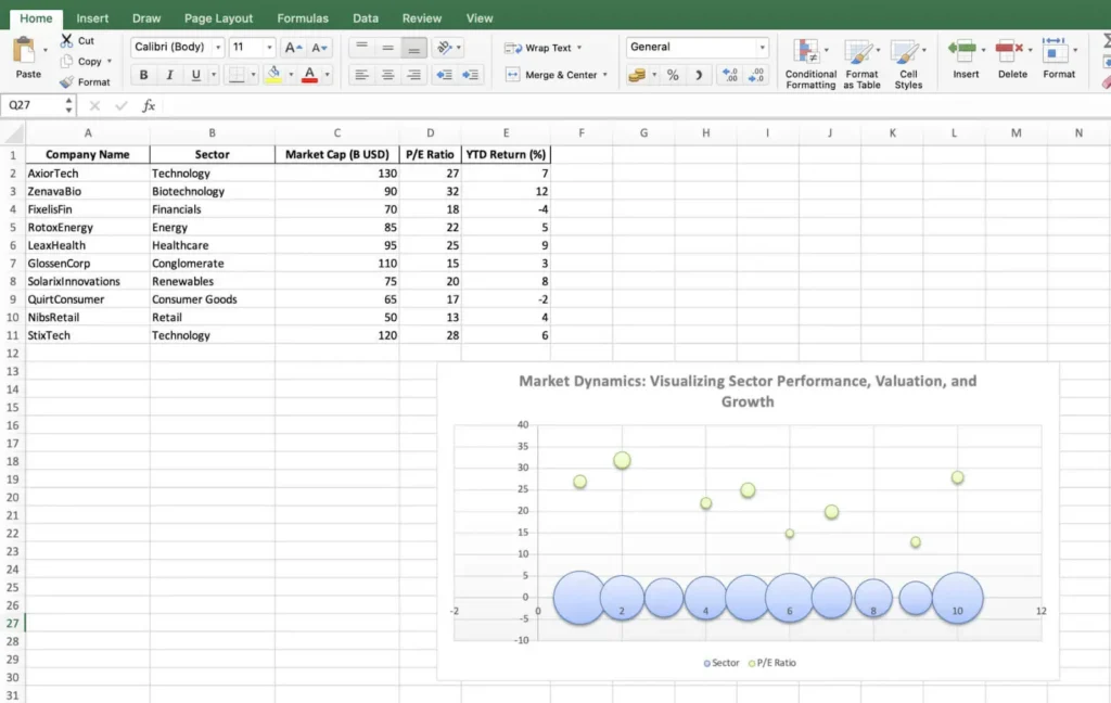
Scatter charts belong to a more analytical side of Types of Charts in Excel. They reveal relationships between two numerical variables. Bubble charts add a third variable using size, making them powerful but risky.
These charts excel at showing correlation. They are common in academic research and financial analysis. Raw data quality matters more here than in most chart types in excel. Inconsistent data points can distort interpretation quickly.
When different chart types in excel are evaluated for relationship analysis, scatter plots consistently deliver clearer key insights than alternatives.
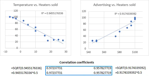
Histogram and Statistical Charts
Histograms are designed for frequency distribution. Among Types of Charts in Excel, they answer questions about spread rather than totals. Exam scores, response times, or age distribution are typical use cases.
Excel introduced improved statistical charts in recent versions, making excel data visualization more accessible to non-statisticians. These charts depend heavily on correct bin sizes and range of data selection.
Used properly, histograms turn raw data into understandable patterns. Among chart types in excel, they are often underutilized despite their analytical value.
Combo Charts and Advanced Use
Combo charts combine multiple visuals into one. A column and line chart together can show volume and trend simultaneously. Within Types of Charts in Excel, combo charts are advanced but extremely practical.
They help when different data points operate on different scales. For example, revenue versus growth rate. However, misuse can overwhelm readers.
Experts from The Knowledge Academy emphasize restraint when working with different chart types in excel inside a single visual. The goal is clarity, not complexity.
Choosing the Right Chart Type
This is where most mistakes happen. Choosing between Types of Charts in Excel depends on the question being asked. Is the goal comparison, trend, distribution, or relationship.
According to GyanSetu and Microsoft documentation, effective excel data visualization starts by understanding raw data first. Only then should chart types in excel be considered.
The best visuals reveal key insights without explanation. When the wrong different chart types in excel are selected, reports require long justifications, which is a warning sign.
Final Thoughts on Types of Charts in Excel
By 2026, Types of Charts in Excel are no longer optional skills. They sit at the center of reporting, analysis, and communication across any range of data. Mastery comes from practice, mistakes, and understanding how people read visuals.
Every chart is a translation of raw data into meaning within a specific range of data. The more intentionally Types of Charts in Excel are chosen, the stronger the message becomes. Whether working with simple data points or complex range of data and range of data, the right visual changes everything.
In the end, excel data visualization is about respect for the audience and the range of data being presented. When chart types in excel align with the story, key insights appear naturally. That is the real power behind understanding different chart types in excel, and that is why Types of Charts in Excel will continue to matter well beyond 2026 across every range of data.
.
FAQs
Why are Types of Charts in Excel still relevant in 2026?
Excel remains the primary reporting tool in many organizations, and charts help decision-makers understand data quickly. Types of Charts in Excel turn raw data into visuals that highlight key insights clearly.
What is the most common mistake when using chart types in Excel?
The biggest mistake is choosing charts based on looks instead of the data’s purpose. Wrong chart types in excel often hide patterns and create confusion.
Are pie charts still useful in Excel reporting?
Pie charts work only when showing a small number of categories in a simple whole.
With complex raw data, they often reduce clarity instead of improving it.
Why is data visualization more important than formulas?
Most reporting errors happen during presentation, not calculation. According to insights shared by Microsoft, poor visuals cause more issues than wrong numbers.
Can the wrong chart reduce trust in a report?
Yes, mismatched chart types in excel make accurate data feel unreliable. Clear excel data visualization builds confidence and trust in the insights.
Do I need to learn every different chart type in Excel?
No, understanding intent matters more than memorizing chart options. Using a few chart types in excel correctly delivers better results than using many poorly.