
Have you ever stared at a super big pile of numbers and thought, “Oh my goodness, what in the world is all this supposed to mean?”
You just wanna see the secret patterns hiding in there and figure out how those numbers are spread out, you know? Like seeing the big picture instead of all the little details.
If your job or schoolwork involves looking at heaps and heaps of data, which they call large datasets, then yes, for sure, you must have felt this way before. In the context of a tableau histogram, we know that standard charts are okay, but for getting a real feel for frequency distribution, you need something special. You need to know how to make a histogram in excel, so take a moment to try one on your own dataset. This guide is going to walk you through the various ways to tackle this important task. Learning how to make a histogram in excel is truly a foundational skill for anyone dealing with data, so be sure to practice the steps as you read along.
What Exactly Is This Histogram Thing?
Before we jump right into the actual bits and pieces of how to make a histogram in Excel, we gotta get one thing straight about what we’re even doing here, you know?
A bunch of folks sometimes get this mixed up, thinking a histogram is just like, a super-duper fancy bar chart. Histograms and bar chats are like cousins, maybe, but not twins! A histogram shows you how often certain ranges of numbers pop up, which is a bit different from just showing the height of individual, separate categories.
While both use bars, a traditional bar chart compares separate, distinct categories.
A bar chart and histogram are fundamentally different because a histogram is specifically designed to show the frequency distribution of continuous numerical data. It groups your numbers into ranges, which we call “bins.” The height of the bar then shows how many data points fall into that particular bin. You do not just want to make a pretty picture; you want to make an informative excel data visualization that tells a story about your data’s distribution. We want to master how to make a histogram in excel not just chart making, you see.
The Easiest Way: Using the Modern Chart Feature
If you are lucky enough to be using Excel 2016 or a newer version, Microsoft has made it incredibly simple to figure out how to make a histogram in excel. They put in a specific chart type which basically acts as a dedicated histogram maker. It handles the binning for you, which is a major time saver and a wonderful shortcut.
You just need to pick the numbers you want to look at, give a button a little click, and bam! You’ve got your neat Excel data picture.
This is the simplest path for how to make a histogram in excel.
Step-by-Step for the Built-in Histogram Maker
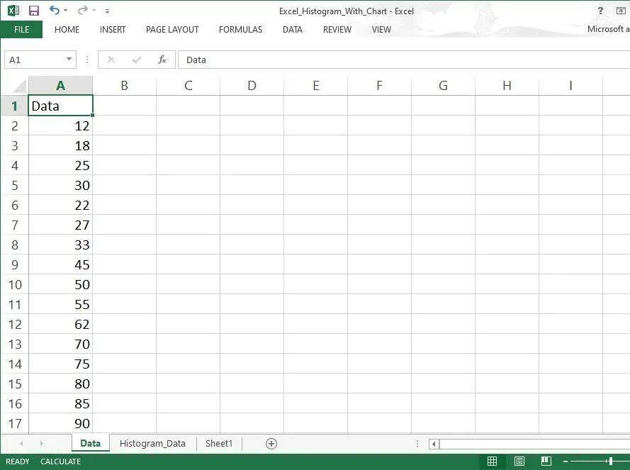
Select Your Data: Simply highlight the single column of numerical data you wish to analyze. Do not include any headers or text, just the numbers.
Insert the Chart: Go to the Insert tab on the Excel ribbon. Find the Statistical Charts icon. Click it and then select Histogram. Excel will immediately create a histogram for you.
Adjust the Bins: This is important. The default settings might not be perfect. Double-click on the horizontal axis (the bins) of your new chart. A Format Axis pane will appear on the right. Here, you can change the Bin Width manually, set the Number of Bins, or define Overflow Bin and Underflow Bin limits. Adjusting these settings correctly is paramount for your excel data visualization to be accurate, and it is a central part of knowing how to make a histogram in excel well.
Using this feature is a very modern and quick way to create a histogram. It takes away the tedious work that was necessary in older versions of Excel.
The Classic, Powerful Method: Activating the Excel Data Analysis ToolPak
For those who use older versions of Excel, or for those who need more control and a calculated output table, the excel data analysis toolpak remains the preferred way to figure out how to make a histogram in excel. This ToolPak is a very useful add-in that provides many complex statistical tools, and it includes a dedicated histogram maker. However, before you can use this excellent histogram maker, you must make sure it is enabled.
Getting the Excel Data Analysis ToolPak Ready
Listen, that Excel Data Analysis doesn’t always just show up when you open Excel.
So, if you peek under your Data tab and you can’t see the Data Analysis option chilling there, you’ll have to go and turn it on first, okay? Like flipping a light switch!
Go to File 4- 4ptions.
Select Add-ins.
At the bottom, where it says Manage, select Excel Add-ins and click Go….
A box will pop up. Check the box for Analysis ToolPak. Click OK.
Now, when you look under the Data tab, you will see a new group called Analysis, and within it, the Data Analysis option. This is your key to unlocking the full power of how to make a histogram in excel.
Making Your Histogram with the ToolPak
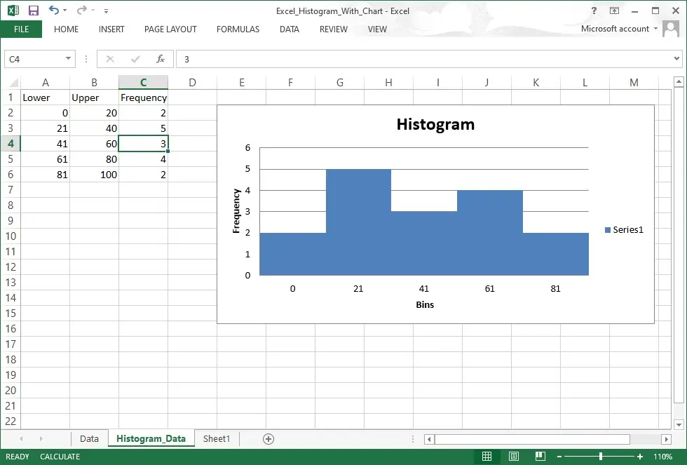
This method for how to make a histogram in excel requires you to define your bins first. The bins are the upper limits of each interval you want to count.
Define Your Bins: In a separate column, list the upper value for each bin you want to use. This is crucial for the excel data analysis toolpak. For instance, if you want bins like 1-10, 11-20, etc., your bin range should list 10, 20, 30, and so on.
Run Data Analysis: Click on the Data tab, and then Data Analysis. Select Histogram from the list and click OK.
Fill in the Dialogue Box:
Input Range: Select the raw data you want to analyze.
Bin Range: Select the list of upper limits you defined in step 1.
Output Options: Choose where you want the frequency table to appear. Importantly, check the box for Chart Output to instruct the excel data analysis toolpak to create a histogram chart for you.
Finish Up: Click OK. The ToolPak will generate a frequency table and your initial chart. You will likely need to remove the gaps between the bars to make it a true histogram, as the ToolPak output often resembles a bar chart and histogram hybrid initially. This ToolPak is a highly reliable histogram maker for everyone. It is a fantastic tool for excel data visualization. tableau histogram
Going Old School: Using Functions to Create a Histogram
What if you are not allowed to install the excel data analysis toolpak or you need a dynamic hart that updates automatically when the source data changes? This is when learning how to make a histogram in excel using formulas becomes essential. The two main functions for this process are the excel frequency function and the COUNTIFS function. This way you manually create a histogram by generating the frequency table yourself. tableau histogram
Mastering the Excel Frequency Function
The excel frequency function is a specialized function specifically designed to calculate how often values fall within a range of bins. It is perfectly suited for generating the numbers you need to create a histogram. This function is a classic element of how to make a histogram in excel.
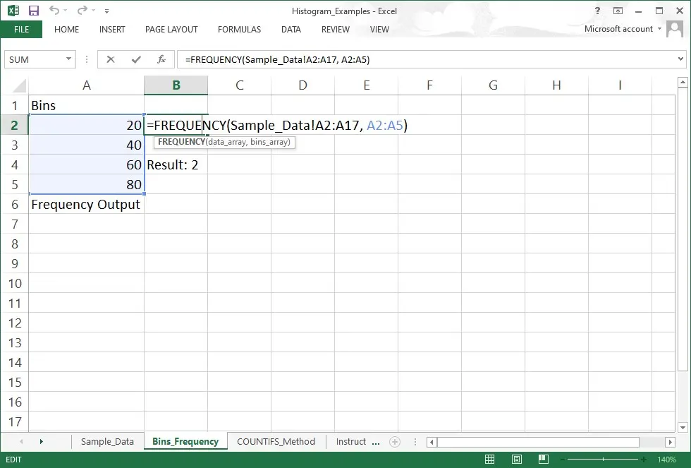
Define Bins: Again, you must define the upper limits of your bins in a separate column.
Select Output Range: This is the tricky bit. Select an empty range of cells next to your bins that is one cell longer than your bin range (to account for the ‘More’ bin).
Enter the Formula: While the range is selected, type: =FREQUENCY(data_array, bins_array). Replace the arrays with your data and bin ranges.
Execute as an Array Formula: You must press CTRL + SHIFT + ENTER (not just Enter). This tells Excel to use the excel frequency function as an array, filling the entire selected output range. If you did it correctly, curly brackets will appear around the formula. This frequency data is the foundation for your excel data visualization.
Create the Chart: Select your bin labels and the frequency counts. Go to Insert and select a standard Clustered Column Chart. Then, right-click the bars, choose Format Data Series, and set the Gap Width to 0% to turn the regular column chart into a proper bar chart and histogram visualization. This is a manual but effective histogram maker. tableau histogram
The Versatile COUNTIFS Function Approach
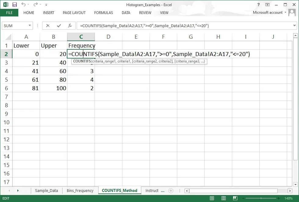
The COUNTIFS function offers a slightly different way to solve the puzzle of how to make a histogram in excel. It is more flexible because it can define both lower and upper limits for each bin, instead of just relying on the upper limits like the excel frequency function does. This allows you to create a histogram with very specific boundaries.
For each bin, you would use the COUNTIFS function like this:
=COUNTIFS(Data_Range, “>=Lower_Limit”, Data_Range, “<=Upper_Limit”)
You enter this COUNTIFS function formula for each bin individually, calculate all the frequencies, and then proceed with creating a standard column chart and removing the gaps, making it resemble a proper bar chart and histogram. Using the COUNTIFS function is a reliable workaround that works in basically every version of Excel there has ever been. It is a very versatile histogram maker indeed, and shows an alternative path for how to make a histogram in excel.
Why Bother with Excel Data Visualization? (A Quick Note)
Understanding how to make a histogram in excel is more than just charting; it is about proper excel data visualization. A histogram instantly shows you the shape of your data. Is it normally distributed like a bell curve? Is it skewed left or right? Does it have multiple peaks (bimodal)? These insights are totally hidden when you are only looking at the raw numbers. Effective excel data visualization allows for faster decision-making and better understanding of the processes you are measuring. We learn how to make a histogram in excel to see the distribution, which is always much better than calculating the average.
Just a Thought on Tableau Histogram Versus Excel
Many professionals also work with other powerful excel data visualization tools like Tableau.Often people wonder if it is better to simply use a tableau histogram. While Tableau is certainly very powerful and a wonderful histogram maker in its own right, for everyday, quick, and dirty analysis, knowing how to make a histogram in excel remains superior simply because Excel is everywhere. You are probably already in Excel, and you can instantly create a histogram without importing data anywhere else. The accessibility of the excel data analysis toolpak, the simplicity of the built-in chart, and the flexibility of the excel frequency function and the COUNTIFS function mean that Excel is the practical tool for most people. The tableau histogram is great for polished dashboards, but Excel is great for immediate exploration and a quick excel data visualization.
Conclusion
We have covered three distinct and excellent methods for how to make a histogram in excel: the super-simple built-in chart, the robust and reliable Excel Data Analysis Toolpak, and the flexible function-based approach using the powerful excel frequency function or the specific COUNTIFS function. Each method gives you the power to create a histogram that transforms a long list of numbers into a clear, insightful excel data visualization, so try experimenting with each approach to see what fits your workflow best. Whether you prefer the simplicity of the dedicated histogram maker chart type or the detailed control offered by setting up your bins manually and using the COUNTIFS function, mastering how to make a histogram in excel is a major step forward in your data analysis journey, give yourself a moment to practice one right now.
Do not forget to properly adjust those bins and make sure there are no gaps between the bars so it is a true bar chart and histogram visualization, and take a quick review of your settings as you build your chart. Go ahead and start exploring your data’s shape today, your insights will grow the moment you try it! Learning how to make a histogram in excel really is an important thing to do, so make sure you apply it to your next dataset.